Companies spend hundreds of thousands of dollars making sure that their website has nice images, animations, videos, effects, and other visual elements. However, sometimes they forget that even a simple website with just a few photos can be much more effective if the copy and the message are accurate.
At the end of the day, customers are just looking for one answer when they browse your site:
“How does this company solve my problem?”
I encourage you to go into three different company websites and see for yourself if this is the first thing that the website answers.
Believe us:
-Customers don’t care too much about your history
-They also don’t care about your product features
-And for sure they don’t care if you use fancy images.
All they care about is THE BENEFITS that they will get once they start working with YOU.
There is no doubt that a meticulously structured website that smoothly integrates design with strategic copywriting significantly enhances user engagement and conversions.
So, in order to integrate both aspects – design and copy – we will give you insightful tips for designers to sidestep potential distractions in site construction, focusing on maintaining user attention on the text, and delve into the powerful psychology of color.
Clear and concise messaging comes first.
Apple’s website serves as an apt example, employing succinct copy to underscore product features, thereby capturing and retaining user attention. Consistency in tone and style across your website fosters a cohesive user experience.
Strategic content placement is key to avoid overwhelming users with excessive information. It’s insightful to note that, according to Google Analytics, 65% of users concentrate on the top two-thirds of a web page. This should guide the placement of your most important messages.
Additionally, compelling Calls to Action (CTAs) that are action-oriented, such as “Sign Up Now” or “Learn More,” work most effectively. Statistics from Unbounce demonstrate that personalized CTAs can enhance conversions by +200%.
Design must serve to support the copy, not detract from it.
Clean and simple designs like those on Dropbox’s website allow the copy to stand out, enabling users to focus on the messaging.
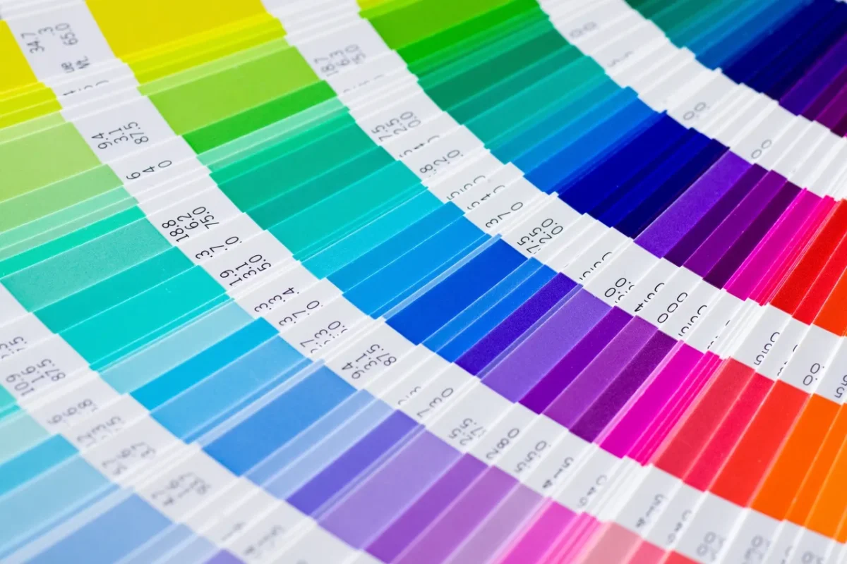
The psychology of color is another CRITICAL factor in web design.
Color can significantly influence users’ emotions and behaviors, and using it strategically can improve engagement and conversions. Each color evokes specific emotions and responses. For instance, blue inspires trust, green denotes growth, and red encourages action. However, cultural context is also essential; what works in one region may not have the same impact in another. Understanding this can allow designers to tailor the design to a specific audience, making it more effective.
Testing color combinations can also be beneficial. A/B testing can reveal what works best for CTAs, or which color schemes keep users engaged longer. Understanding color psychology allows designers to build more effective, engaging, and conversion-oriented websites.
To sum up, if you are planning to restructure your existing website or create a new one, please consider that Copywriting might be more important than design.
All the efforts in hiring professional copywriters won’t be in vain. It is the best great start for your company, and you will have the chance to see future conversions by analyzing the metrics.
If you have a fantastic design and poor copy, the site won’t convert anywhere near, as well as having superb copy and poor design. However, if you add awesome design to amazing copy, you will have the best chance of conversions.
We welcome your insights regarding the manifold benefits of hiring an expert copywriter, particularly concerning its inevitable positive impact on your sales figures. An exceptional, purpose-built website tailored to your prospective clients is certainly a compelling advantage to consider.
Check out how our team can help here.

