Here’s a universal truth in copy writing: short and clear messages ALWAYS win.
This could not be further from the truth with billboards.
Adding more lights, buying a larger sign, or using 3D shapes don’t really add much to the equation. What counts the most is a clear and concise copy.
Have you ever stopped walking for a second because of a cool message you saw on a billboard?
Maybe you raised your head when driving your car just to read an ad on one of those huge signs?
You’re not alone! This is because billboards are designed to catch your attention in just a few seconds while capturing as much as possible about a brand’s product or service.
And if you think of social media as a high-traffic road for online users, digital ads are basically small billboards that should grab your attention in microseconds.
The truth is that new writers can definitely draw inspiration from old billboards that were print on huge physical displays. In fact, the efficiency of language on these billboards was not just an artistic choice but a necessity, as advertisers had limited space to convey their message.
What are billboards with short-form copy used for?
- Advertising local and national brands to a wide audience.
- Introducing new products to the market with immediate impact.
- Raising awareness on social and public interest issues.
- Pointing out directions to nearby businesses or attractions.
- Building brand recognition through repeated visual exposure.
- Complementing multi-channel campaigns with consistent imagery and slogans.
- Stimulating conversations around topical events and cultural phenomena.
- Displaying public art to enhance community aesthetics and engagement.
- Driving quick consumer actions with prominent calls-to-action.
- Targeting specific audiences in high-traffic locations for maximum reach.
Aren’t these the goals that every copywriter is also trying to achieve? Of course!
That’s why we’ve compiled 10 billboards so you can see examples to help inspire you.
The Top 10 Billboards To Inspire Writers In Short-Form Copy
#1 Life Is Bitter – Fernet Branca
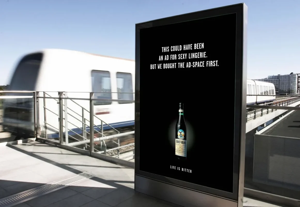
The cool thing about this ad is that Fernet Branca is a bitter alcoholic drink. The company used the idea of life being bitter, and playing with the concept to provoke the sensation of bitterness to remind readers of the time when they tried the drink.
#2 Incomplete Jingle Bells for Christmas – JB
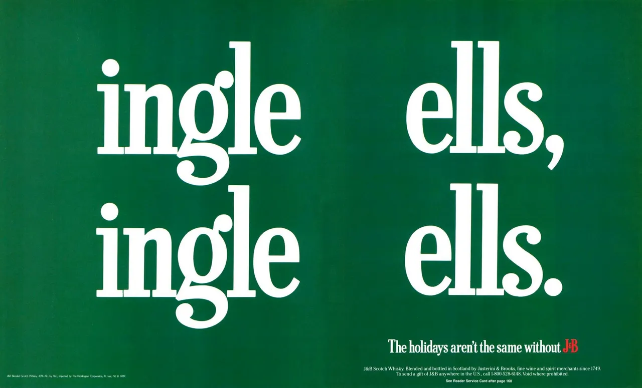
This billboard draws lots of attention because the letters “J” and “B” are missing, prompting readers to ask in their minds WHY this is the case. The great thing about this ad is that most people have heard the “Jingle Bells” song, so the context here matters. Additionally, the company used a Christmas color scheme, highlighting the JB logo in the color red, and appealing to the emotion that something is missing, in this case, a good bottle of JB whiskey at your Christmas table.
#3 – Cauliflower Ice Cream – Farm To Spoon
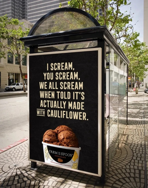
There are two interesting elements to this ad. First, the writers used the repetition of the word “scream”, so you can visualize people screaming when you read this ad, which appeals to emotion. Secondly, it has an original message since it refers to a substitute ingredient to make the ice cream healthy, which is cauliflower.
#4 – This is not an apple – DePaul University
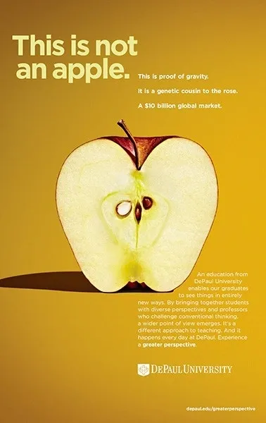
Our team at Copyriders liked this billboard because it plays with the concept of negation to draw attention. Anyone reading this sign will immediately ask themselves, “Why is this not an apple?” which acts as a call to action to read the copy below. It also includes the analogy of gaining a new perspective on life through education, promoting the university’s brand.
#5 – Money can buy time – Rolex
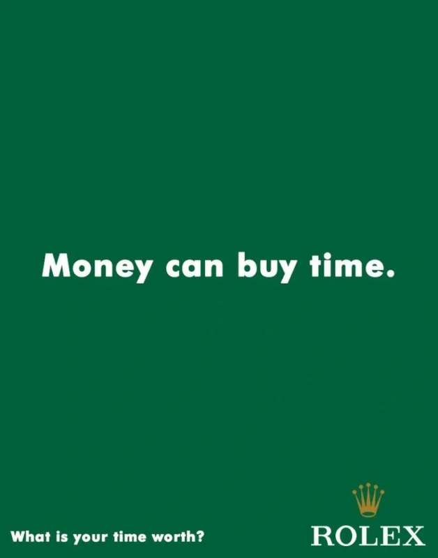
Simple, yet very effective. Without displaying a fancy watch, the copy alone appeals to the notion of self-worth highlighting the value of having a Rolex as a high-end product.
#6 – You Need Balls – Loto Libanais
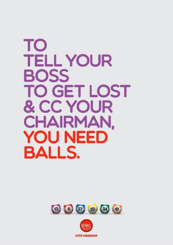
Writing an ad about a lottery is not easy at all. In this case, the company was really successful in using humor and wit bt introducing the concept of “having balls” and making yourself picture the situation when you WIN and QUIT YOUR JOB.
P.S: The frame “picture this” is very common and effective in copywriting.
#7 – To be, or not to be? – Oxford University
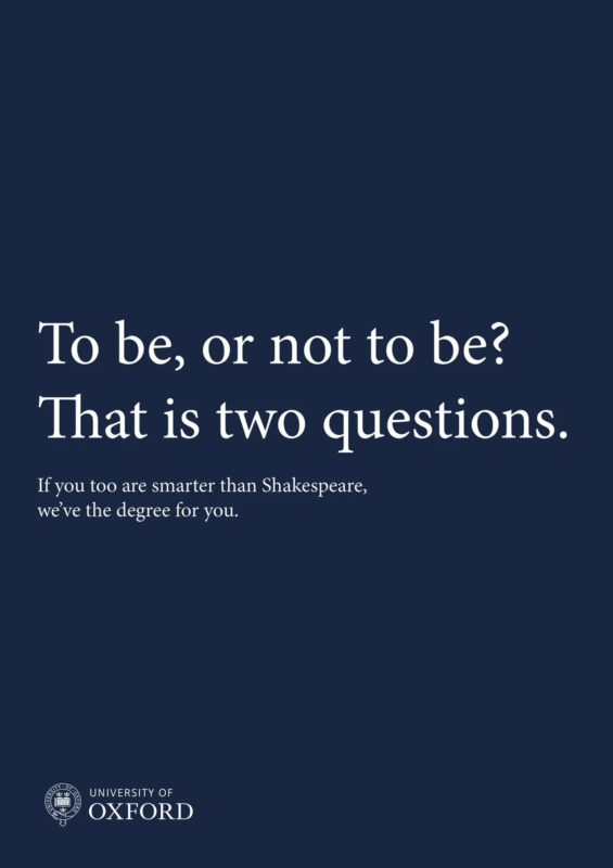
This ad is great because the copy alone is very original and challenges an already-established idea. It makes readers feel smart so that they will be compelled to join Oxford.
Digital Ad Copywriting: The “Modern Billboards”
Fast-forward to the present, and digital ads are essentially the billboards of the internet. These modern equivalents share the same foundational principles: catch the user’s attention quickly and convey a message quickly.
To excel in short-form copy, especially in crafting digital ads that carry the essence of billboards, copywriters should heed the following characteristics that have been consistent throughout time:
1. Be Concise.
Billboards taught us that less is more. In social media, attention spans are even shorter, making brevity an absolute must. Every word must earn its place in the ad, as surplus language can dilute the message’s impact.
2. Clarity
The message should be immediately understandable. Like this one 🙂
3. Context
Billboard copywriters had to be keenly aware of the context in which their message would be seen—by whom, in what location, and at what time. Digital ads take this to a new level with the ability to target demographics with precision, making relevance more crucial than ever.
4. Visual Integration
On billboards, copy rarely stands alone; it’s part of a visual symphony that includes images, color schemes, and typography. Digital ads carry this legacy forward. Have you ever seen an ad without a design? Never.
5. Memorability
Iconic billboards are remembered long after the first glance. Ads should achieve the same, along with a click from the user (of course).
6. Call-to-Action (CTA)
Even the earliest billboards had a CTA, urging viewers to visit a store, attend a show, or buy a product. In digital ads, the CTA is more direct, often clickable, which makes sales even EASIER than ever before.
7. Adaptability
A successful billboard could often be adapted in different locations or contexts. Likewise, your ad copy should be measured with A/B testing and constant iteration and optimization in your copy.
—————————————
In essence, every ad—whether on a highway billboard or a digital banner—is a story condensed into a tagline, an image, or a button. The best copywriters are those who can tell that story in a way that resonates, compels, and converts.
Which billboard did YOU like the most?
