Choosing the right color is an art that greatly boosts the psychological impact that your content creates in your audience, drastically increasing your conversions.
But forget the statistics that say a green button is more likely to be clicked.
If your website is yellow, the green button probably won’t have the same impact as if it were red.
Heinz changed the color of their signature ketchup from red to green and sold more than 10 million bottles in the first 7 months, resulting in $23 million in sales. However, HubSpot saw a 21% increase in conversions by changing the color of a call to action (CTA) button from green to red.
So, is there a guide to follow? The answer is YES.
BUT, it all depends on the type of audience, media, company, and product or service.
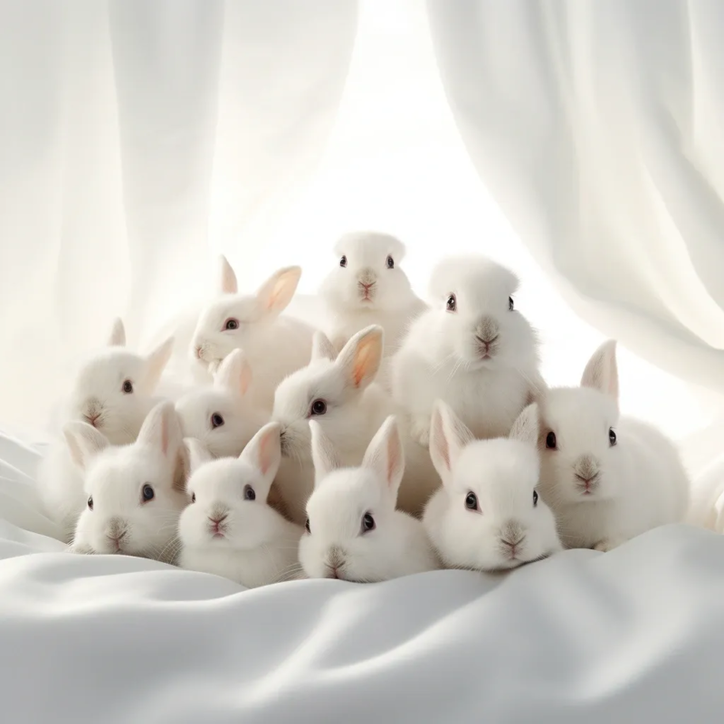
From a psychological perspective, the human brain tends to visualize complementary colors when it gets tired of seeing one color. Let’s see a perfect example that illustrates this theory:
Click on the image, and stare at the black cross in the middle of the image below and count 12 seconds. Are you seeing any other colors?
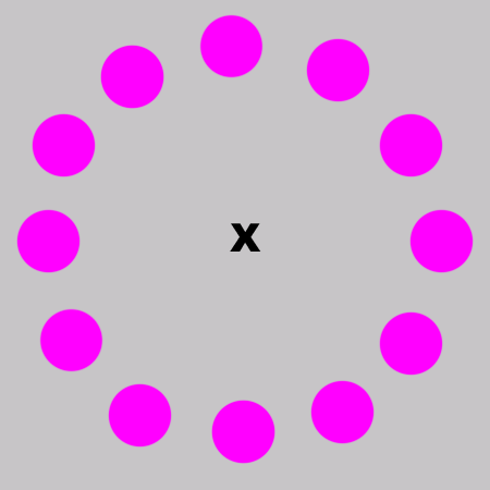
If you were able to distinguish other colors, then great! You’ll be able to easily visualize what we’ll explain below.
The Clockwork Conversion Color Model
The “Clockwork Conversion Color” model proposes that when the human eye tires of one color, it tends to visualize its complementary.
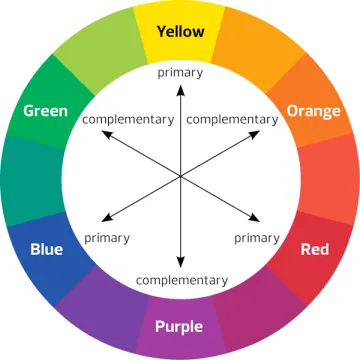
Complementary colors sit directly across from each other on the color wheel, a representation based on the Red Green Blue model. Essentially, they are color opposites. For instance, if a website’s primary color is green, its complementary color would be red.
To enhance the effectiveness of your call-to-action (CTA) button, a copywriting agency might suggest the following:
Reserve the Complementary Color for the CTA Button: If our website is green, the complementary color will be red. Scattering red tones all over the site will diminish the button’s red intensity and impact. Therefore, you should ONLY use red for the CTA button.
Use a Pure Complementary Color: It’s much more effective when the complementary color isn’t mixed with blacks, whites, or other hues. Employing primary or secondary colors proves more impactful. And always remember to incorporate a shadow or gradient, which signals to viewers that it’s a clickable button.
Balance with Shadows, Highlights, and Tonal Variations: If the button is purely green, the rest of the site should predominantly feature a nuanced orange to avoid overwhelming our visitors. Two saturated complementary colors create tension when placed together. However, if one is shaded with black, white, or a subtle tint, it results in a color harmony that always works.
How can you properly use colors to complement your content writing?
Humans are programmed to store information about our experiences, places, objects, and the feelings they evoke just by seeing them.
Effectively applying color psychology to digital marketing can achieve:
- An increase in the conversion rate of your website or online store.
- Your landing pages become more effective.
- Colors are more important than you think when making decisions about your company’s corporate image, as they are a means of non-verbal communication through which messages can be conveyed.
Let’s explore each color one by one.
Color BLUE – Calm and Corporate

Blue is the favorite color for many people.
It induces a sense of calmness, boosts productivity, and promotes serenity, which is why it’s commonly found in office spaces. It’s often associated with trust and security.
Because of its perceived reliability and trustworthiness, blue is a suitable color for insurance companies, banks, and financial institutions. Major social media platforms like Facebook, Twitter, and LinkedIn have chosen blue for their logos, aiming to gain user approval and maintain a professional image.
However, blue can suppress one’s appetite, so if you’re in the food business, it might not be the best color for your brand. On the other hand, beverage brands like using blue since it conveys a feeling of freshness and is symbolic of water.
If your website offers products related to personal, home, or industrial cleaning, then blue is an apt choice. Additionally, airlines, airports, cruises, water parks, and marine sports also prefer to use this color.
Color RED – Energy and Passion

Red quickly grabs attention.
It evokes strong emotions and increases appetite. It is also associated with passion, intensity, love, and danger.
Whenever you think about implementing red in your content or digital marketing strategies, think about the following:
– It creates a sense of urgency, which is why it’s used in online stores during sales.
– It accelerates the heartbeat, and for this reason, it’s likened to what a person in love feels when they see their beloved, thus having the opportunity to create a strong bond with your target audience.
– It’s commonly used by food brands since it stimulates appetite.
– It tends to work with impulse buyers.
Red is also related to energy, so you can use it to advertise cars, motorcycles, drinks, games, sports, and high-risk activities. Platforms like YouTube use it because their content requires action, as they promote reactive activities.
Color YELLOW – Optimism

Yellow is often seen as a cheerful and warm shade. It embodies a sense of competitiveness and optimism. However, its vibrancy can sometimes strain the eyes. At times, this color can also be perceived negatively, representing traits like cowardice and deceit.
Despite these potential drawbacks, yellow is frequently used to signify optimism and youth. Its eye-catching nature makes it a popular choice in brick-and-mortar stores, particularly for window displays, and on websites where it often colors “Call To Action” buttons. The hue suggests clarity in processes and, when associated with the sun, it can impart a warm perception to a brand. This perception extends to the electronics sector where the color finds use. Furthermore, platforms like Snapchat and Google leverage yellow, aiming to foster a sense of close-knit community among users, encouraging them to create inventive content.
Color ORANGE – Impulse and Joy
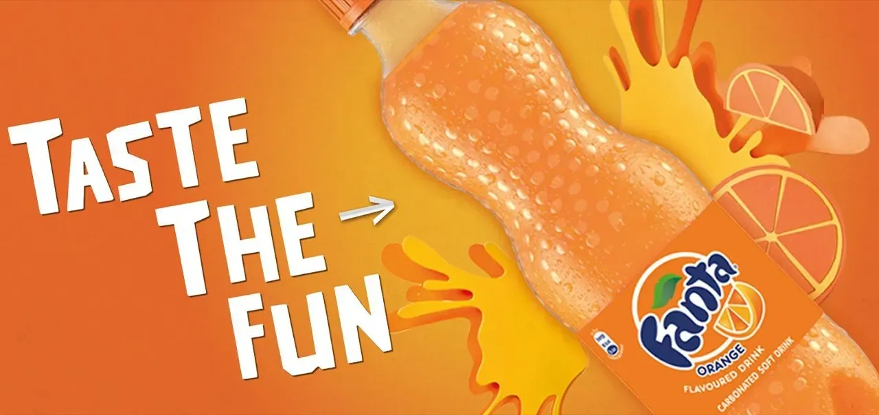
The color orange exudes feelings of enthusiasm, excitement, warmth, and caution. Beyond these initial impressions, it can also signify attributes such as innovation, youth, fun, accessibility, and vitality.
The vibrant nature of orange is often harnessed to capture attention and evoke a sense of joy. For instance, on many digital platforms, orange is chosen for “Call to Action” buttons that prompt actions like buying, downloading, or subscribing. This captivating quality also makes it effective in drawing in impulsive buyers, particularly when used on landing pages.
Color GREEN – Growth & Abundance

The color green is often linked to health, tranquility, wealth, and nature. Additionally, it signifies growth or something that is blossoming. Interestingly, employees surrounded by this hue report fewer stomach aches and episodes of depression. Yet, the impact of green largely depends on its shade. Deep shades invoke feelings of abundance, while lighter hues offer calming effects.
Retail stores often use green in their interiors to create a soothing ambiance for customers. If your target audience is health-conscious, this color might be the perfect choice for your brand. Furthermore, green evokes a sense of responsibility towards animals and the environment, making it a prominent choice for eco-friendly initiatives.
Its associations with nature and commerce make it a popular color in content related to economic or spiritual growth. Beyond that, green supports communication and scientific content as it embodies notions of evolution and progress. This is one reason platforms like WhatsApp have incorporated green into their branding.
Color PINK – Peace and Delicacy

This color stirs feelings of love while also conveying a sense of peace. Darker shades are particularly effective in expressing sentiments of fun, excitement, energy, and youth. In contrast, lighter pink tones are typically linked to romantic themes.
Given its strong association with femininity and romanticism, this color is recommended for brands targeting young women. As such, it would be especially fitting for websites showcasing cosmetics and products specifically designed for women.
Color PURPLE – Exclusivity & Spirituality
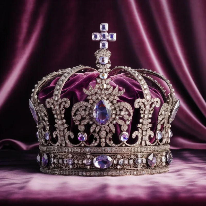
Purple is often associated with qualities such as loyalty, well-being, success, and wisdom. This strong connection to attributes of leadership and distinction is one reason why kings and other influential leaders historically donned purple attire. Beyond its regal associations, purple has deep spiritual undertones, often tying it to divinity. This royal link also makes purple a symbol of luxury and sophistication.
In the modern consumer world, purple’s touch of glamour makes it a favored choice for beauty and facial care products. It imparts a perception that a brand is not just luxurious, but also creative, imaginative, and playful. Furthermore, the color’s consistent association with wisdom further solidifies its esteemed position in cultural and symbolic interpretations.
Color WHITE – Purity & Cleanliness
This color is often associated with light, purity, innocence, and tranquility. When used in smaller spaces, it provides an illusion of spaciousness, making the area seem more expansive. While it generally holds positive connotations, it’s worth noting that in some Middle Eastern cultures, white symbolizes mourning and death.
The color white evokes feelings of freshness, cleanliness, and hygiene, making it particularly apt for medical and health-related products. Beyond its association with health, white also has ties to technology and is featured in the branding of some airlines.
Color BLACK – Class & Elegance
This color is closely tied to authority, power, sophistication, stability, and strength. On the flip side, it can also evoke associations with evil, death, and mystery. In the realm of marketing, it’s synonymous with elegance and sophistication, often being linked to classic, luxurious, or high-quality products.
Consequently, it’s commonly featured in brands that cater to a high-end or prestigious audience. Furthermore, its versatile nature allows it to serve as a foundational hue, providing a strong contrast when paired with other colors.
Color BROWN – Nature & Ruggedness

This color brings to mind earthiness, nature, and rustic charm. However, it’s essential to tread carefully because it can sometimes be perceived as dull or even be associated with dirt. Brands often employ this hue to communicate a “natural and organic” ethos, much like a certain coffee brand does. It’s crucial to use this color judiciously since it’s among the less favored shades by many.
Despite its challenges, it can be apt for graphic representations of products that are warm and have an earthly connection.
Case Study: How Coca-Cola changed its brand color to introduce a friendlier beverage
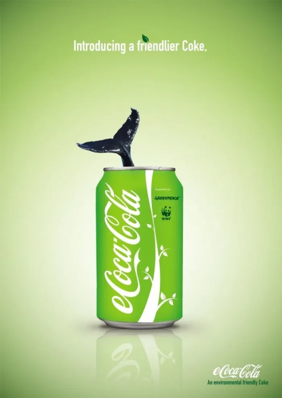
The Coca-Cola brand is iconic for its red color but has faced criticism due to the potential health implications for its consumers and its environmental impact during production.
However, by switching their usual advertising color to green, the brand’s perception shifted. The green hue gives a feeling that the company is more environmentally conscious and suggests that the product is now more natural. This change in color strategy can lead consumers to view the brand in a new light and potentially restore their trust.
As you will be able to observe the green color really changes the perception of the entire brand, and just like we discussed above, the color green gives it that health-conscious and eco-friendly feeling.
How does color impact conversion in your content and online sales marketing?
Many websites fail to properly highlight their Call To Action (CTA) buttons, leading them to go unnoticed. As a result, users, not seeing anything of relevance, choose to leave the page.
To prevent this from happening to you, it’s advised to use an appealing color that contrasts well and encourages users to take action.
Choosing colors for “Call to Action” (CTA) buttons is pivotal in digital marketing, since it can influence user perception and reaction. Research from Quicksprout shows that color ads are 26% more recognizable than black and white.
Buyer types:
Impulsive: React to blue, orange, and black.
Traditional: Prefer shades like pink, light blue, and dark pink.
Deal seekers: If your audience is looking for low prices, dark blue and green are ideal.
Tips for color selection:
• Maintain consistency.
• Avoid color saturation.
• Distinguish between passive and active colors.
• Seek contrasts.
• Collaborate with designers.
While it’s true that there are many vibrant and appealing colors that can help boost interactions, their effectiveness will largely depend on how you use them.
It’s advisable to experiment and test which color aligns best with your website’s aesthetics and objectives. However, there are other factors that might be impacting your conversion rates, such as the placement of your button, the typeface used within the buttons, and even the buttons’ shapes.
One strategy to consider is the “Isolation Effect”, which aims to guide user actions through the strategic use of standout colors. This can be especially useful across various platforms like emails, websites, online stores, or social networks.
To implement this, you can adopt the 60-30-10 rule. When choosing a color palette, you should pick three distinct colors and apply them in proportions of 60%, 30%, and 10%. The boldest color, which should be used sparingly at 10%, should lead the reader toward completing the Call to Action (CTA)
Conclusion
Colors hold a profound influence on consumer perception and actions in digital marketing, and it can be a great way to complement your writing. Their strategic application can drastically improve online engagements, conversions, and sales. Understanding the psychology behind colors can aid marketers in making informed decisions fit for their purpose and target audience.
Our team has used all of these principles to work on landing pages and multiple ads for our clients.
Are you looking for an expert team of copywriters?